
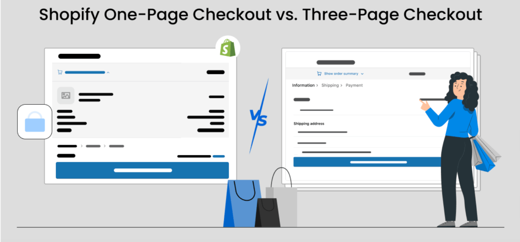
When it comes to optimizing your Shopify store, checkout experience is a crucial factor in reducing cart abandonment and increasing sales. One of the key decisions store owners face is choosing between a one-page checkout and a three-page checkout. Each has its advantages, but which one is right for your business? Let’s explore One-Page vs. Three-Page Checkout to help you make an informed decision.
One-Page Checkout: Faster Conversions?
A one-page checkout condenses the entire purchasing process into a single page, allowing customers to enter their shipping, billing, and payment details without navigating through multiple steps.
Pros:
- Speed & Simplicity – Customers can complete their purchase faster, reducing the risk of abandonment.
- Fewer Clicks – With fewer barriers, the customer has less time to rethink their purchase.
- Mobile-Friendly – Ideal for mobile users who prefer quick transactions.
Cons:
- Information Overload – Too many fields on one page can feel overwhelming.
- Limited Upselling Opportunities – Less space to offer cross-sells and promotions.
Three-Page Checkout: Structured & Trustworthy?
A three-page checkout divides the process into separate steps: shipping information, billing details, and payment confirmation.
Pros:
- Better Data Validation – Errors can be caught early, improving accuracy.
- More Trust-Building – Breaking the process into steps may feel more secure to shoppers.
- Upselling & Personalization – More space for adding recommended products or discounts.
Cons:
- Longer Process – Additional steps can cause frustration and increase abandonment rates.
- More Clicks Required – Each step introduces a potential drop-off point.
Which Is Better?
Ultimately, A/B testing your checkout flow on Shopify is the best way to determine which format works for your audience. Large retailers often see success with a structured, multi-step checkout, while smaller businesses may benefit from the simplicity of a one-page design.
For more on optimizing Shopify checkouts, check out our guide on best Shopify checkout practices.

Does Your Add to Cart Button Color Matter?
The color of your Add to Cart button is more than just an aesthetic choice—it can directly impact conversion rates.
Color Psychology & Buying Decisions
Different colors trigger different emotions and actions:
- Green – Encourages action and is often associated with trust and security.
- Orange – Creates urgency and excitement, driving impulse purchases.
- Red – Can be attention-grabbing but may also indicate caution.
- Blue – Conveys reliability but may not always prompt immediate action.
A/B Testing Button Colors
Running A/B tests on your Shopify store can help determine the best color for your audience. For example, if your store primarily sells premium products, a sophisticated black or navy blue button may convert better than a bright red one.
For more tips, check out our Shopify conversion rate optimization strategies.
Final Takeaway
Both your checkout design and button colors play a crucial role in your eCommerce success. Optimize strategically, test frequently, and adjust based on data insights. Need help improving your Shopify store? Shop Optimizers can analyze and implement high-impact changes to increase conversions.